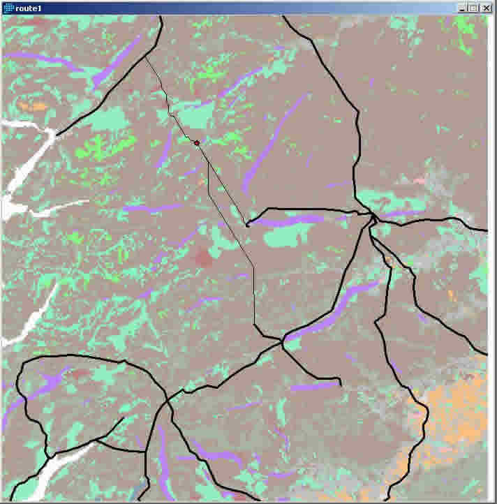
 figure.1 GIS map showing land use in colours, e.g. the purple/blue areas are lochs; the orange areas are the built environment; with the electricity transmission network superimposed (black lines).
figure.1 GIS map showing land use in colours, e.g. the purple/blue areas are lochs; the orange areas are the built environment; with the electricity transmission network superimposed (black lines).
The red dot above centre of image with 3 thin black lines branching from it represents a possible wind farms site (chosen by the user). The thin lines are the best 3 grid connection routes.
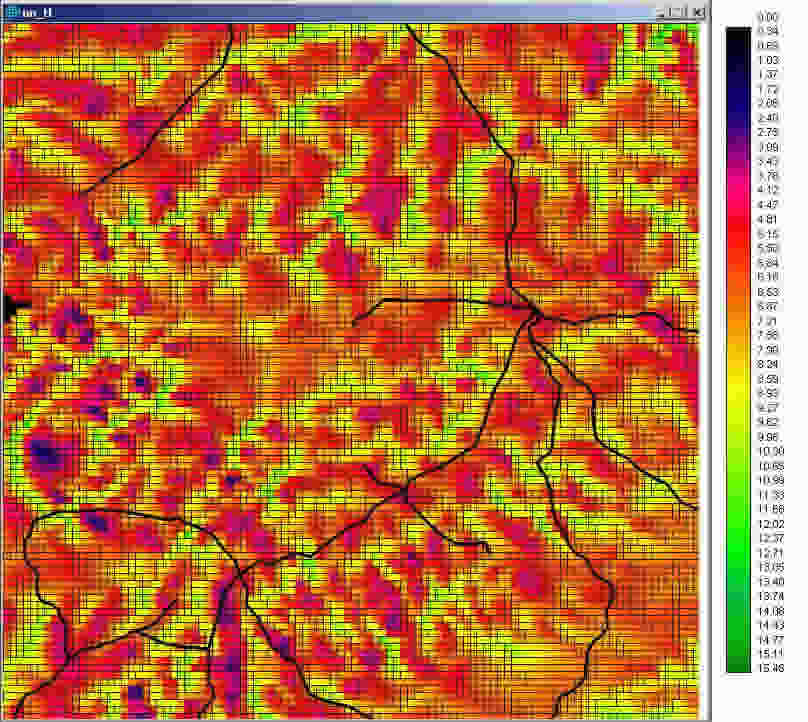 Figure.2 shows the same geographical location as in figure.1 but the colours in this figure represent wind speed. The colours in this image emphasise the valleys (green/yellow) and hills (red/purple).